The premise & the project
Notre Locus is a bookshop, art gallery and community space coming soon to London. Their aim is to create equal access to literature for young expats and refugees from places including Ukraine, Russia, and Belarus – in their own languages – while they live away from their native countries.
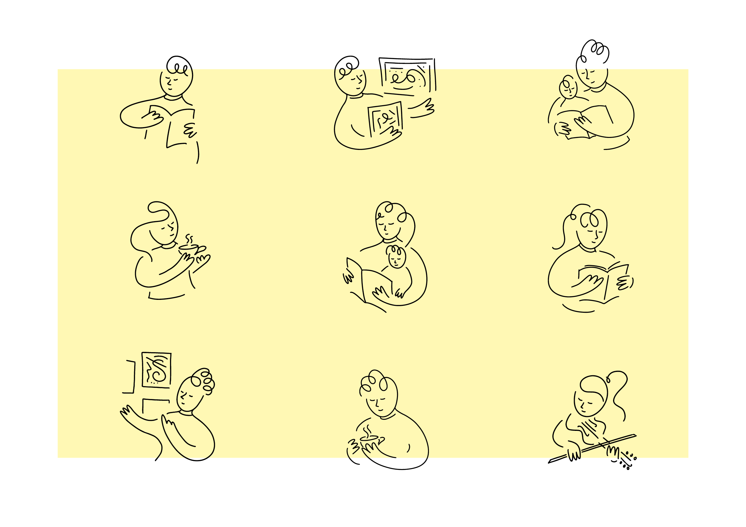
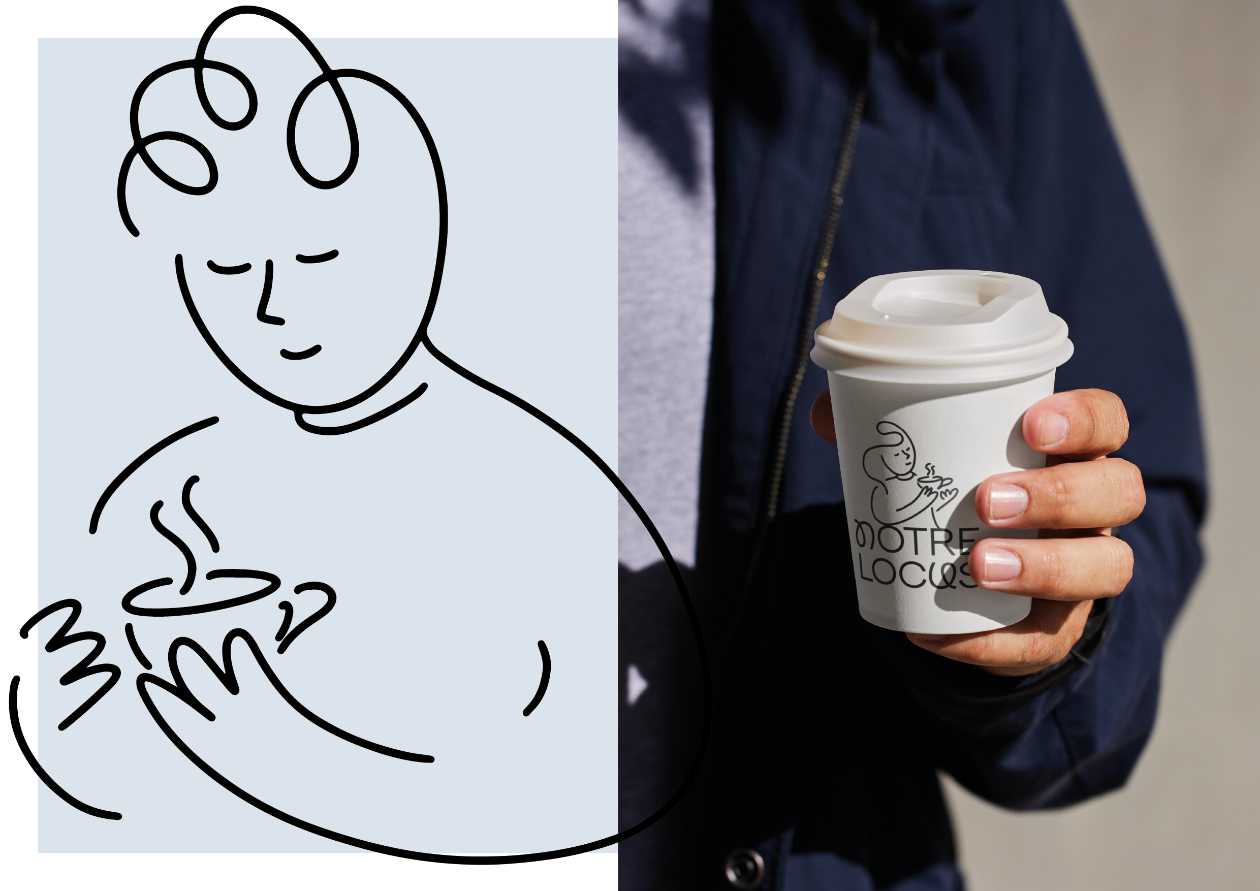
Publishing can be a tightrope when politics censor subjects and authors, so Notre Locus is creating a space promoting freedom of speech, inclusivity and unity. When the team at Notre Locus approached me to create their brand identity, I set out to create a warm, playful and inviting visual language – one that felt inclusive and whimsical. With books, and language, at the forefront of the mission, I developed an identity based on quirky typography to highlight the importance of words. This led to my illustrations of happy characters interacting with various aspects of the shop and gallery.

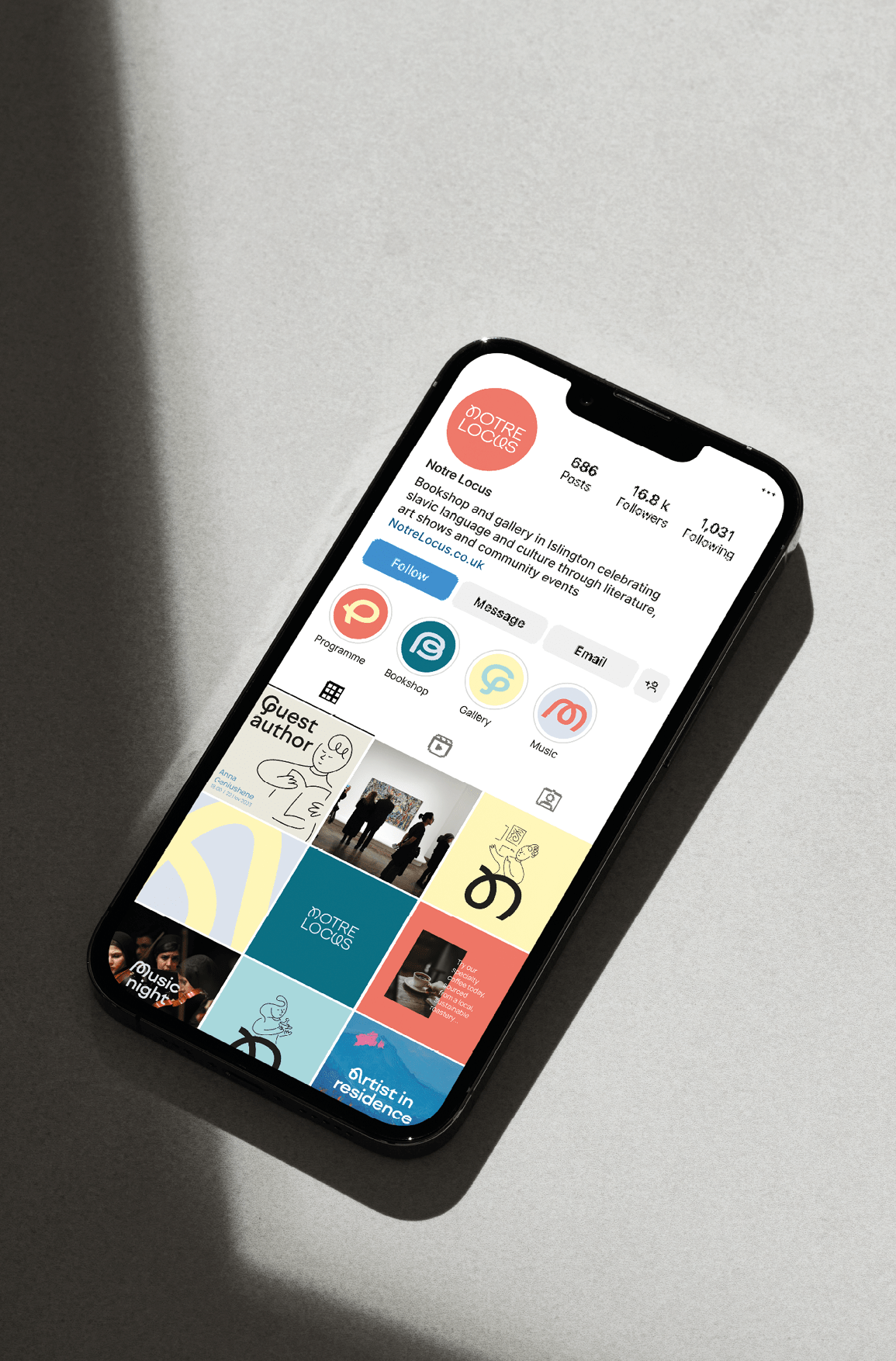
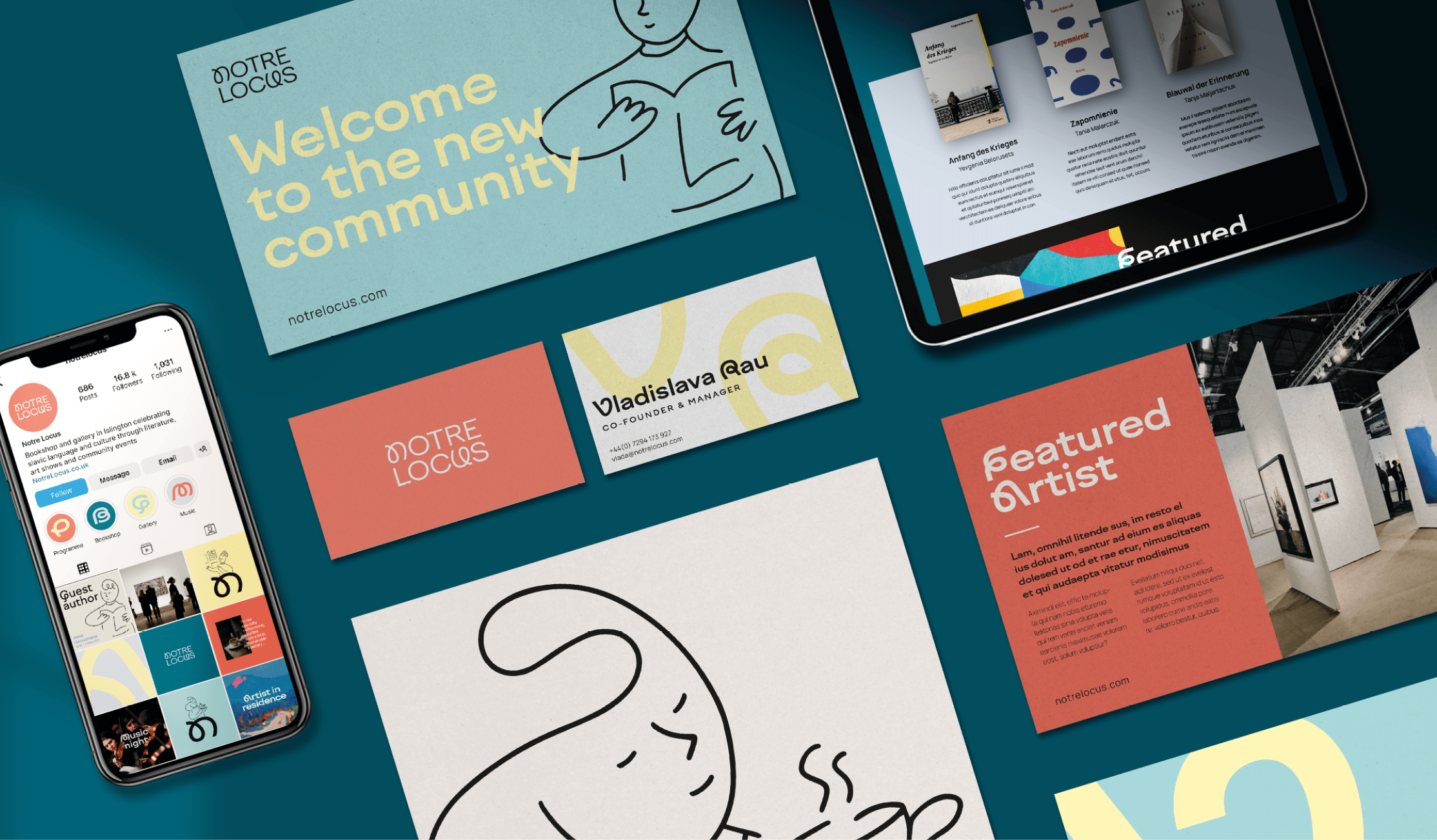
Using the adaptable hero typeface, I created compositions from the letterforms to highlight the importance of words & language. The logo also uses the adaptable letters, bringing a consistency through the brand assets.

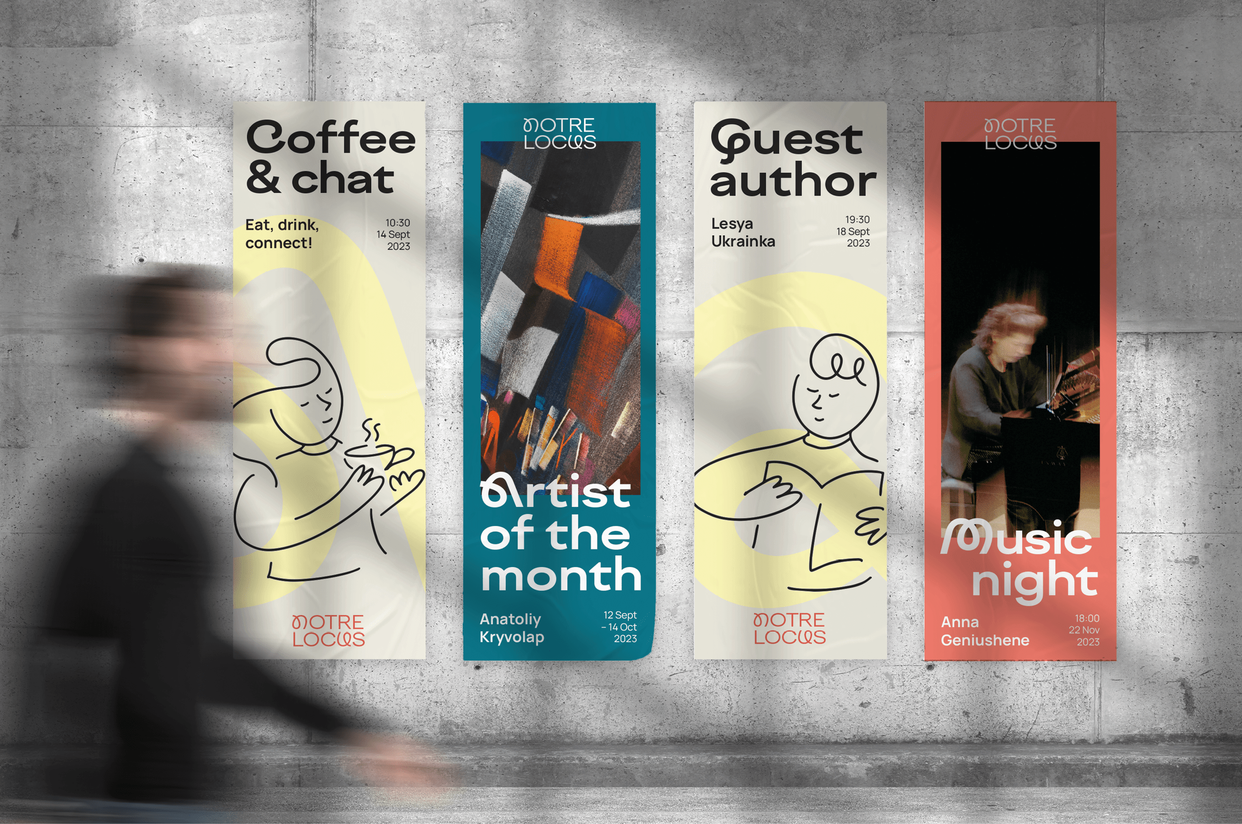
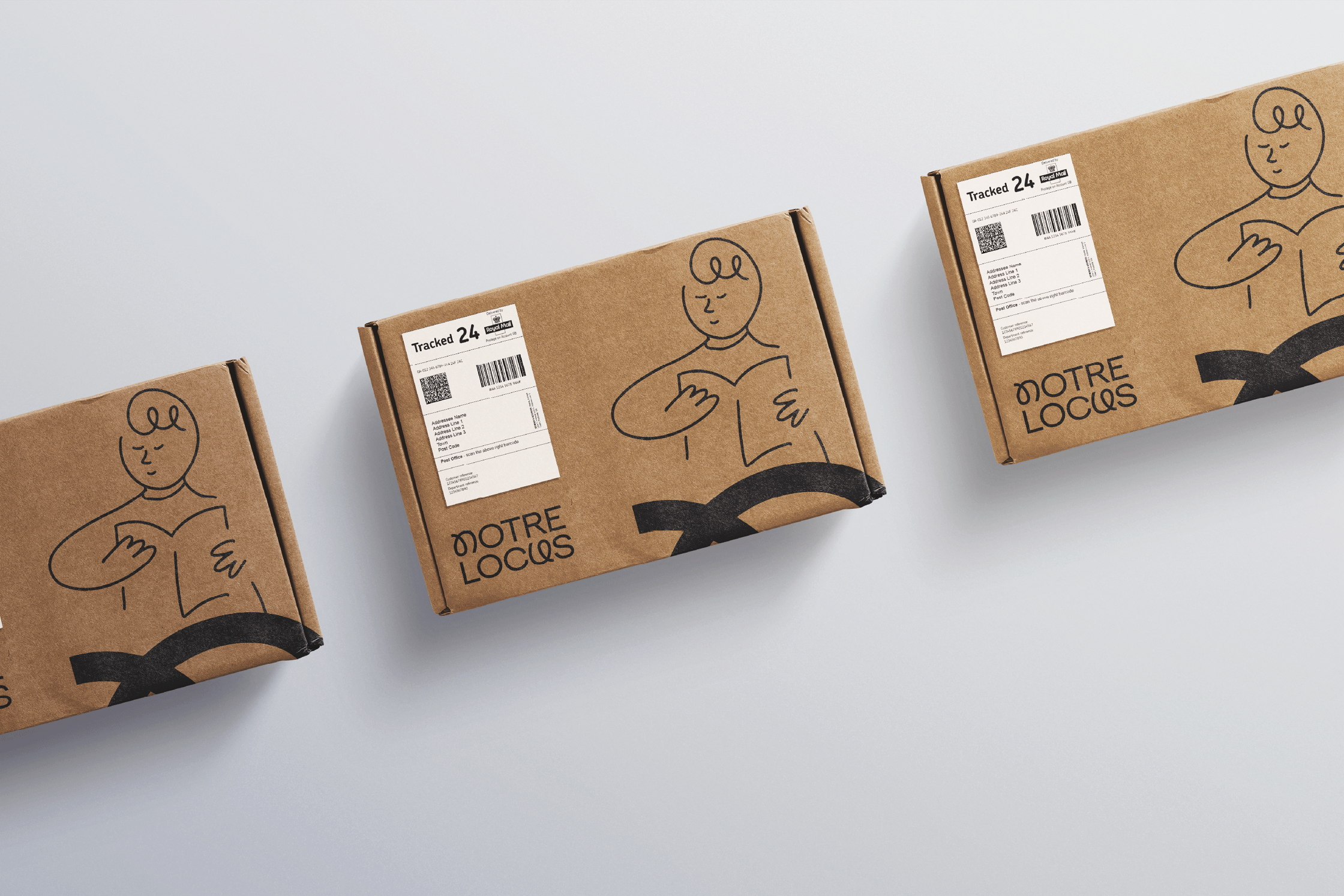
I created a set of sketchy hand-drawn illustrations to showcase the various aspects of Notre Locus’ offering. The illustration strokes emulate the loopy forms of the typeface and create a cohesive visual language.
