The premise & the project
Creating a brand for the trickiest client on the books: me.
Branding your own business might sound like a fun task, but it’s really one of the hardest jobs to undertake. With all the tools at your fingertips, the possibilities are endless, making the job of refining a concept very difficult. My approach was to take myself through the branding process in the same way I would with a client – from defining my brand values and services, creating a leading concept, and designing visuals based on a solid strategy.

All about perspective…
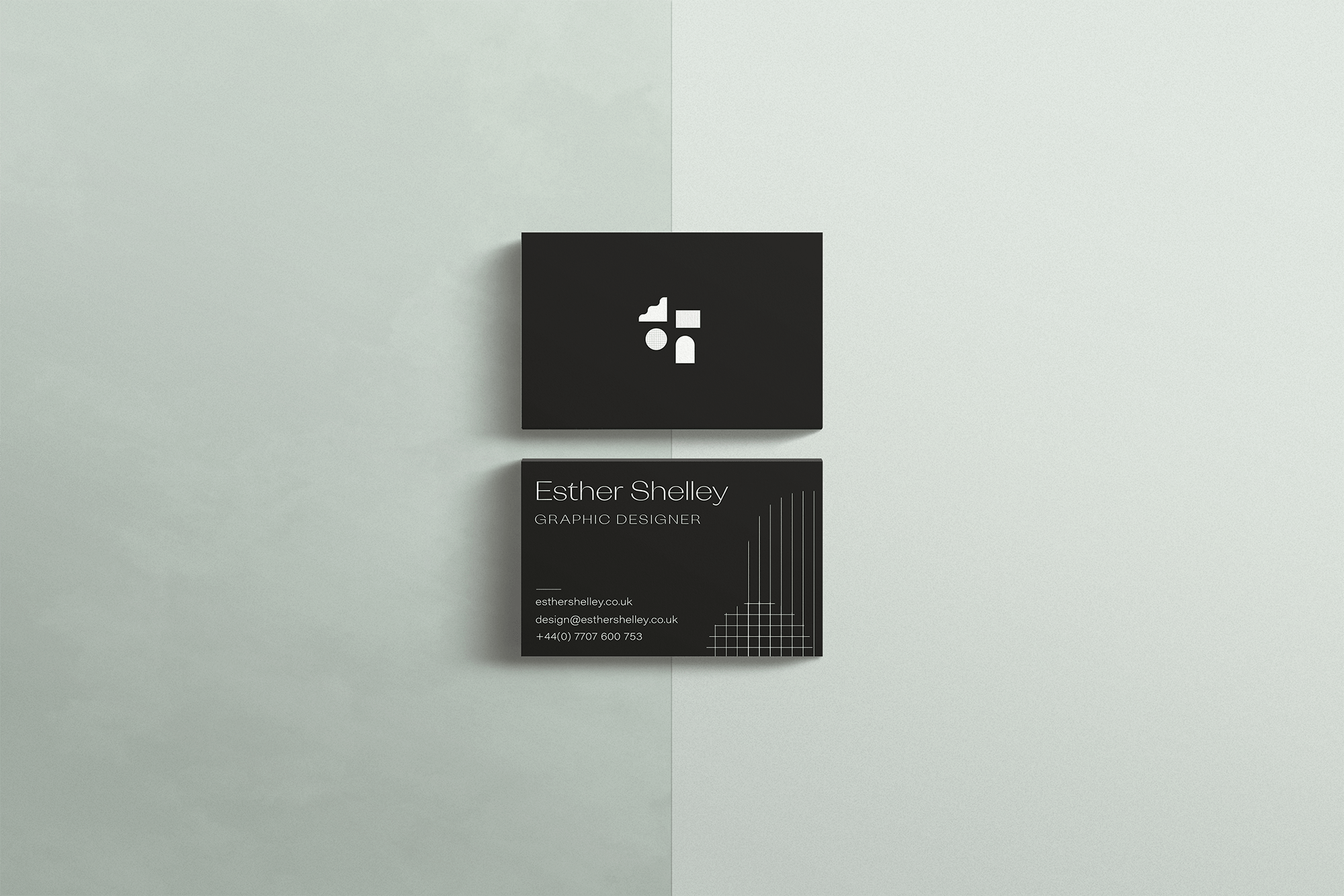
So what are all these lines and shapes about? While refining my brand purpose I came to the conclusion that my core goal was helping clients see their business and brand from a new perspective. As a designer, I’m not here to create pretty things (although lots of the things I create are pretty). I’m here to guide clients through a creative process and reach their goals – whether that process is brand development, creating a piece of marketing material or designing assets for social media, I provide a roadmap for my clients’ success through strategic thinking and beautiful design.
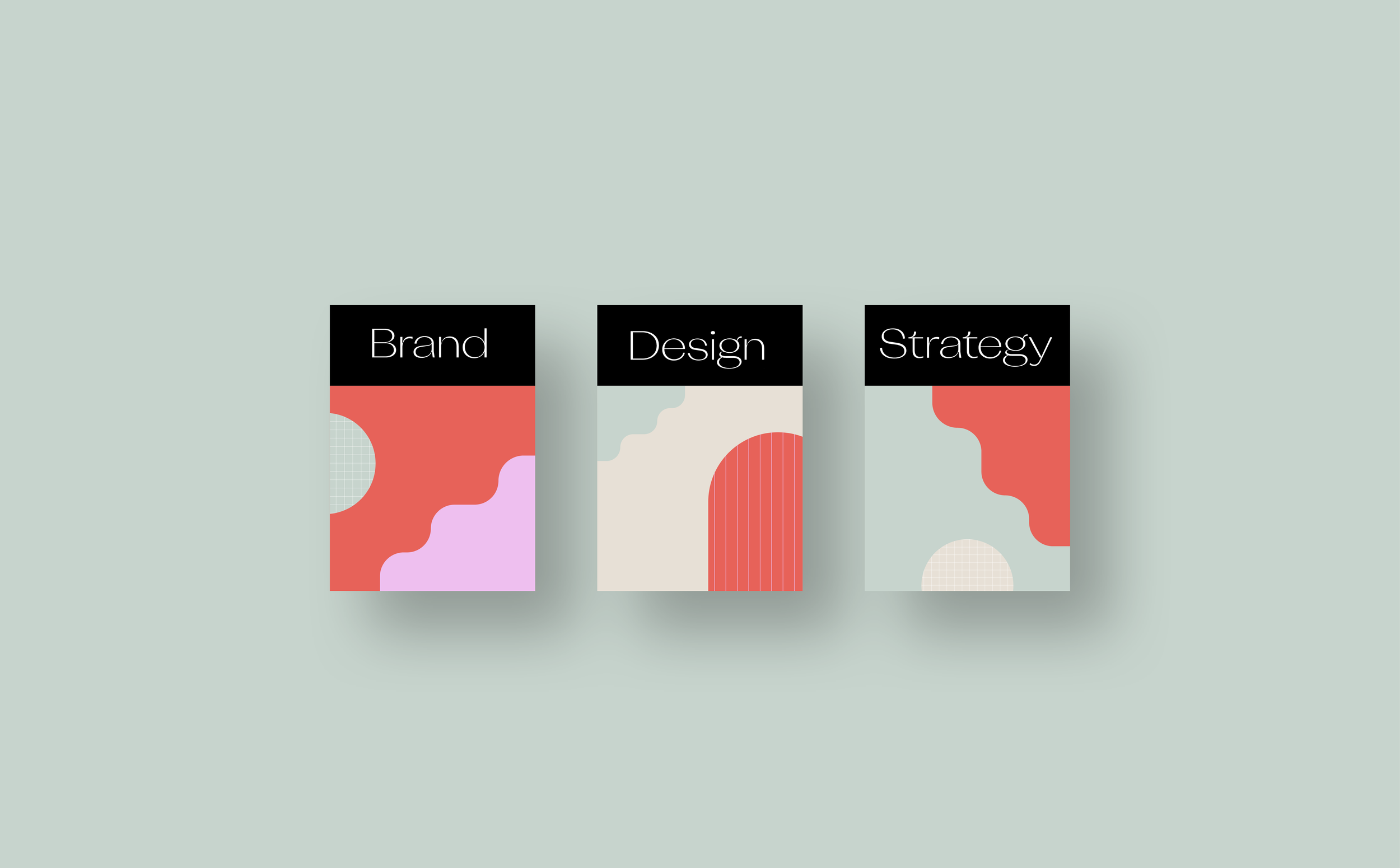
This ‘roadmap’ idea inspired me, and I started to visualise map elements; gridlines; contours; area blocking from an aerial view. These formed the key graphic elements of the brand.
My palette combines neutral colours with fun and bright hues to reflect the diverse nature of my design work. I’m not a one-aesthetic-fits-all designer, and when you look at my projects, there are often big leaps in visual styling from one to the next. That’s because I’m here to realise my clients’ individual visions, not apply a specific aesthetic to all projects based on my personal taste.